A picture is worth a thousand words. Or so they say. Are they right, or are they wrong?
Don't judge a book by it's cover. You also hear that all the time. Do you agree with it or not?
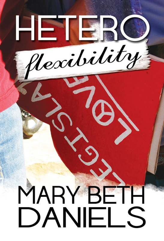
Well, unfortunately, we all do just that constantly. We judge books by their covers. We judge by the pictures we see. Our guest today has a bit to say about book covers. You just might find it interesting. Katie Jennings, take it away!
You never get a second chance to make your first impression. At least, that’s what my dad always told me, and he’s completely right! Think about your life in terms of the products and services you are exposed to on a daily basis…which ones stand out the most to you? Which ones really take off and which ones fall into the dark depths of obscurity? I’ll answer the question for you: the ones that succeed are the ones that draw in potential buyers with a clear, instant impression. In other words, a picture is worth a thousand words. Or, in our case as authors, a book cover is worth every single word you ever wrote in a novel.
Think about it. You’re perusing the aisles at Barnes and Noble, or scanning the Bestseller’s list on Amazon. What catches your eye? What appeals to you? Obviously, for every consumer the answer to that question is different. Which is why as authors we MUST know our market. We MUST know who we are trying to sell our books to.
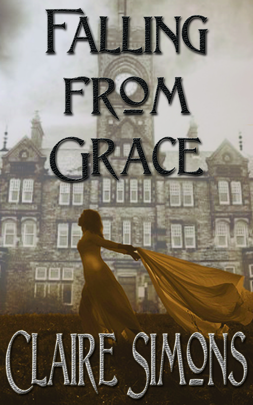
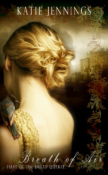
As an example, take my book cover for Breath of Air, which is the first book in my contemporary fantasy series The Dryad Quartet. On the cover you see a girl, her face hidden so that the reader (I’m marketing to females, FYI) can easily slip into the main character, Capri’s, shoes. Much emphasis was put on her hair, so that readers can identify that Capri is the light, airy blonde in the book with a soft nature and sweet disposition (note: the bird on her shoulder is both representative of her “Snow White” qualities as well as her gift of Air). In the first chapter of Breath of Air, you learn that Capri can control birds, so having the bird on the cover was key.
Also note the castle in the background. This gives potential readers a clue as to the “type” of fantasy book Breath of Air might be. It’s clearly not set in a grungy New York alleyway or a sweltering Florida beach with palm trees. No, according to the distant image of the castle, the book will take place in a strange land, both elegant and extraordinary. It lends to the concept that Capri feels like something of a “princess” fallen into a realm she had never before imagined.
Okay, so the imagery is all very important, right? But what about when your book is shown in tiny thumbnail form in the midst of thousands upon thousands of other books? What is it that will cause readers to click on your thumbnail before someone else’s?
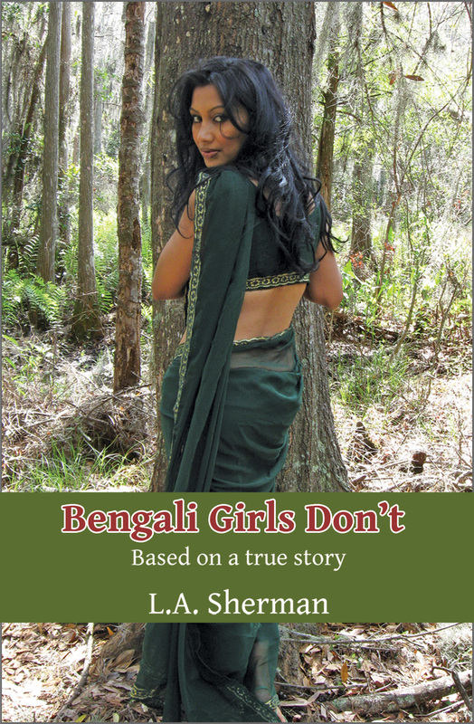
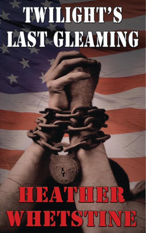
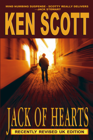
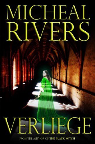
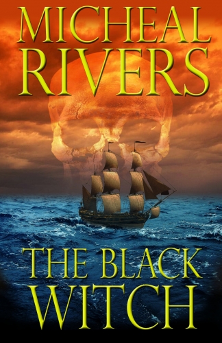
For me, anyway, it’s the coloring. Coloring is very important, but keep in mind that this varies drastically by genre. Is your book a thriller or horror? You should have dark colors, maybe reds and grays, and there should be plenty of contrast. Or, alternately, do a lighter version with big, bold text and contrasting images in stark black and white. Convey an emotion through the colors you use. If it’s a romance novel, the softer the colors and more dramatic the imagery (a woman with flowing hair, arching back, delicate hands, etc) the better. Readers will notice the book first by color, then by image. Think about your market and the readers you want to attract, and what colors may catch their eye.
So what about your title font? What I recommend is looking up other books in your genre, and seeing what other authors have done. Fantasy and romance books generally have loopy, calligraphy-like text. Thrillers tend to have bolder, stronger, harsher text. It is important that you get the text right. Make the extra effort and surf the free font download sites, and hunt up some new fonts to use. As long as it’s easy to read and available for commercial use, you should be good.
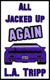
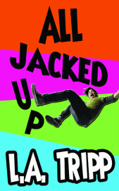
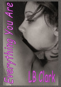
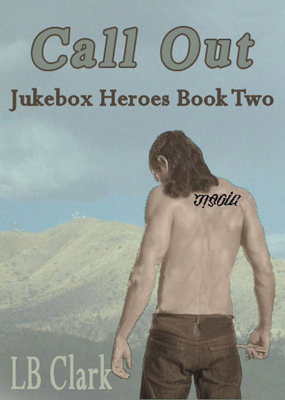
Lastly, I offer you my most important, crucial bit of advice, even though it will only appeal to some of you. But here it is anyway, because I honestly cannot stress this point enough: If you have a book series, make sure that each and every cover in that series is CONSISTENT with the other covers. And I’m talking style, imagery, title text placement, author name font and placement, etc. Readers should be able to easily identify that those books go together. It breaks my heart when I catch authors not following this important rule, because they are not imagining their books sitting side by side on a shelf. And that is how we must look at our work. We must think of ourselves as not just self published authors, but as good enough to be up there with the big boys, our books sitting right beside theirs. If we lose those high standards for ourselves, then the reputation for self published authors suffers.
So please, keep all of this in mind as you create your covers, and good luck!
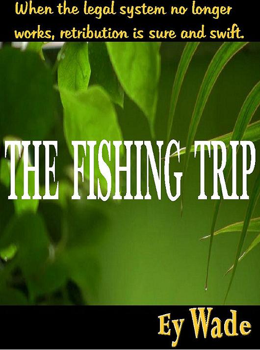
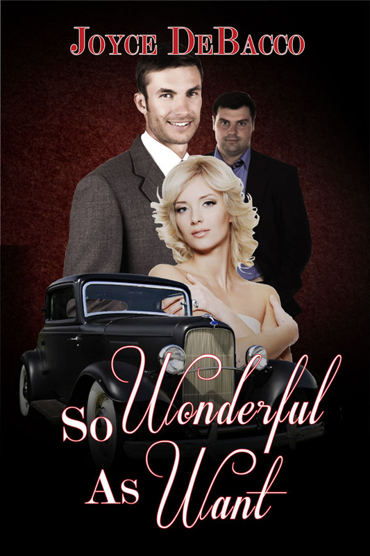
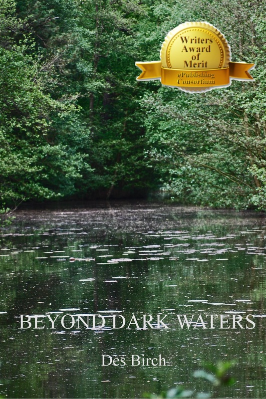
As always, if you like what this author has to say in their guest spot, please patronize them by clicking on their book on the sidebar. I make absolutely nothing off your purchase through this site. I'm just glad to have them stop by and hope you get some pleasure from meeting another author.
Don't judge a book by it's cover. You also hear that all the time. Do you agree with it or not?
Well, unfortunately, we all do just that constantly. We judge books by their covers. We judge by the pictures we see. Our guest today has a bit to say about book covers. You just might find it interesting. Katie Jennings, take it away!
You never get a second chance to make your first impression. At least, that’s what my dad always told me, and he’s completely right! Think about your life in terms of the products and services you are exposed to on a daily basis…which ones stand out the most to you? Which ones really take off and which ones fall into the dark depths of obscurity? I’ll answer the question for you: the ones that succeed are the ones that draw in potential buyers with a clear, instant impression. In other words, a picture is worth a thousand words. Or, in our case as authors, a book cover is worth every single word you ever wrote in a novel.
Think about it. You’re perusing the aisles at Barnes and Noble, or scanning the Bestseller’s list on Amazon. What catches your eye? What appeals to you? Obviously, for every consumer the answer to that question is different. Which is why as authors we MUST know our market. We MUST know who we are trying to sell our books to.
As an example, take my book cover for Breath of Air, which is the first book in my contemporary fantasy series The Dryad Quartet. On the cover you see a girl, her face hidden so that the reader (I’m marketing to females, FYI) can easily slip into the main character, Capri’s, shoes. Much emphasis was put on her hair, so that readers can identify that Capri is the light, airy blonde in the book with a soft nature and sweet disposition (note: the bird on her shoulder is both representative of her “Snow White” qualities as well as her gift of Air). In the first chapter of Breath of Air, you learn that Capri can control birds, so having the bird on the cover was key.
Also note the castle in the background. This gives potential readers a clue as to the “type” of fantasy book Breath of Air might be. It’s clearly not set in a grungy New York alleyway or a sweltering Florida beach with palm trees. No, according to the distant image of the castle, the book will take place in a strange land, both elegant and extraordinary. It lends to the concept that Capri feels like something of a “princess” fallen into a realm she had never before imagined.
Okay, so the imagery is all very important, right? But what about when your book is shown in tiny thumbnail form in the midst of thousands upon thousands of other books? What is it that will cause readers to click on your thumbnail before someone else’s?
For me, anyway, it’s the coloring. Coloring is very important, but keep in mind that this varies drastically by genre. Is your book a thriller or horror? You should have dark colors, maybe reds and grays, and there should be plenty of contrast. Or, alternately, do a lighter version with big, bold text and contrasting images in stark black and white. Convey an emotion through the colors you use. If it’s a romance novel, the softer the colors and more dramatic the imagery (a woman with flowing hair, arching back, delicate hands, etc) the better. Readers will notice the book first by color, then by image. Think about your market and the readers you want to attract, and what colors may catch their eye.
So what about your title font? What I recommend is looking up other books in your genre, and seeing what other authors have done. Fantasy and romance books generally have loopy, calligraphy-like text. Thrillers tend to have bolder, stronger, harsher text. It is important that you get the text right. Make the extra effort and surf the free font download sites, and hunt up some new fonts to use. As long as it’s easy to read and available for commercial use, you should be good.
Lastly, I offer you my most important, crucial bit of advice, even though it will only appeal to some of you. But here it is anyway, because I honestly cannot stress this point enough: If you have a book series, make sure that each and every cover in that series is CONSISTENT with the other covers. And I’m talking style, imagery, title text placement, author name font and placement, etc. Readers should be able to easily identify that those books go together. It breaks my heart when I catch authors not following this important rule, because they are not imagining their books sitting side by side on a shelf. And that is how we must look at our work. We must think of ourselves as not just self published authors, but as good enough to be up there with the big boys, our books sitting right beside theirs. If we lose those high standards for ourselves, then the reputation for self published authors suffers.
So please, keep all of this in mind as you create your covers, and good luck!
As always, if you like what this author has to say in their guest spot, please patronize them by clicking on their book on the sidebar. I make absolutely nothing off your purchase through this site. I'm just glad to have them stop by and hope you get some pleasure from meeting another author.


 RSS Feed